Eco-branding
White for print. Dark for digital.

Personality
To make our brand coherent and unique.

Brand voice
Simplify to the essential, always write with a smile.

Naming
Generic, descriptive or hero, respecting spelling rules.

Color
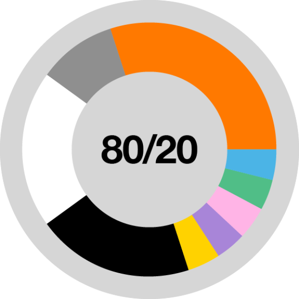
We are a black, white and orange brand - this is our core color palette. We also use supporting colors.

Typography
Always use Helvetica Neue as your primary font.

Photography
We use photography across a wide range of communications and it is our preferred image style.

Illustration
We have a simple, flat and flexible illustration style and use it in a bold graphic and colorful way.

Mix
An interaction between the photo and the illustration to highlight the brand role.

Film and animation
Personalised and emotional demonstration

Music and sound
One sonic logo and a coherent musical territory.

Grids and layouts
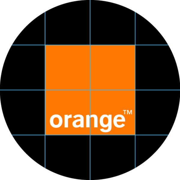
To create clear and impactful communications.
Icons and stickers
Black, white or orange; always use original artwork.

Digital
Download guidance, tools and assets.
